Canopy x Youth To The People
2023
Deliverables
Packaging
Project Overview
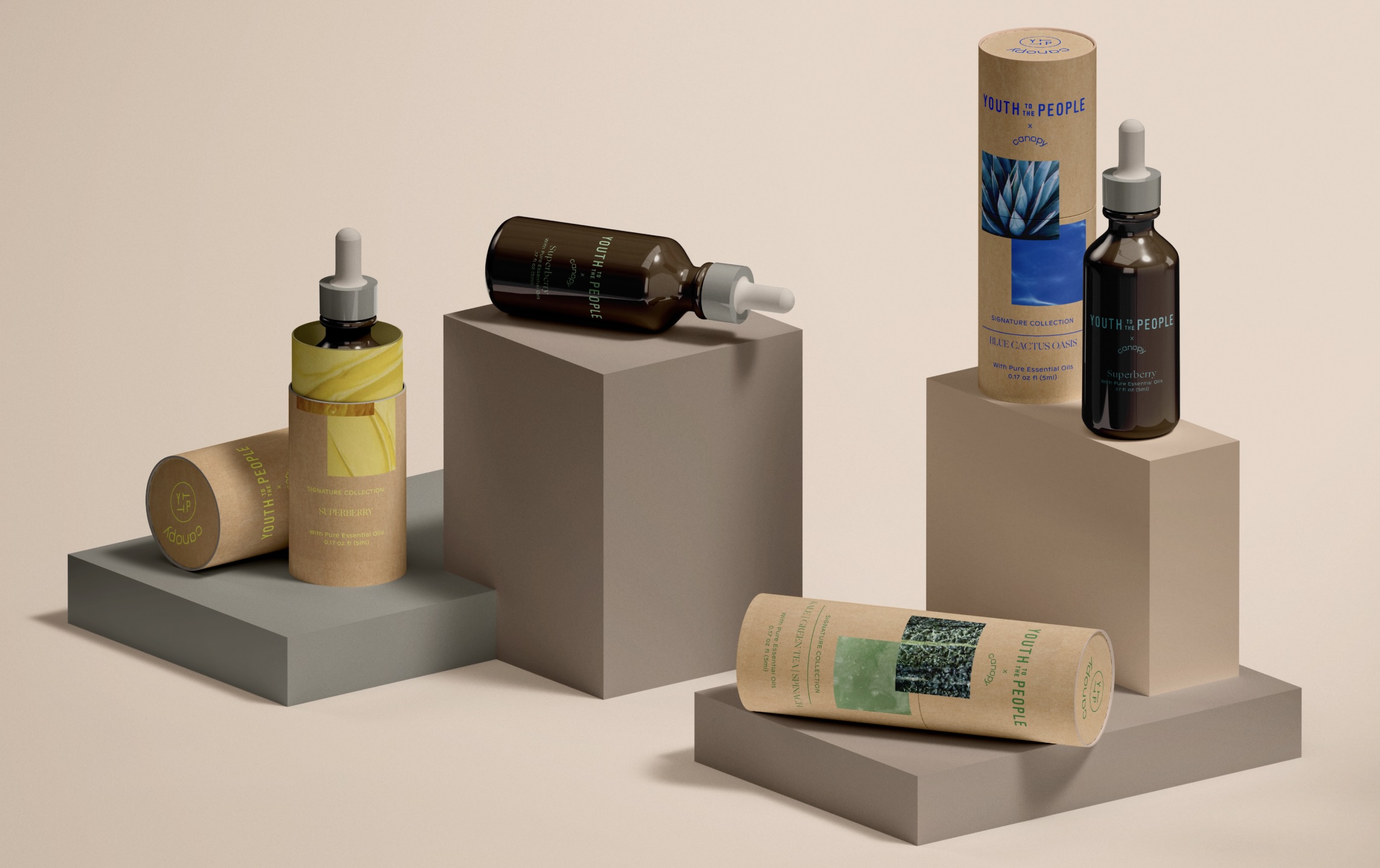
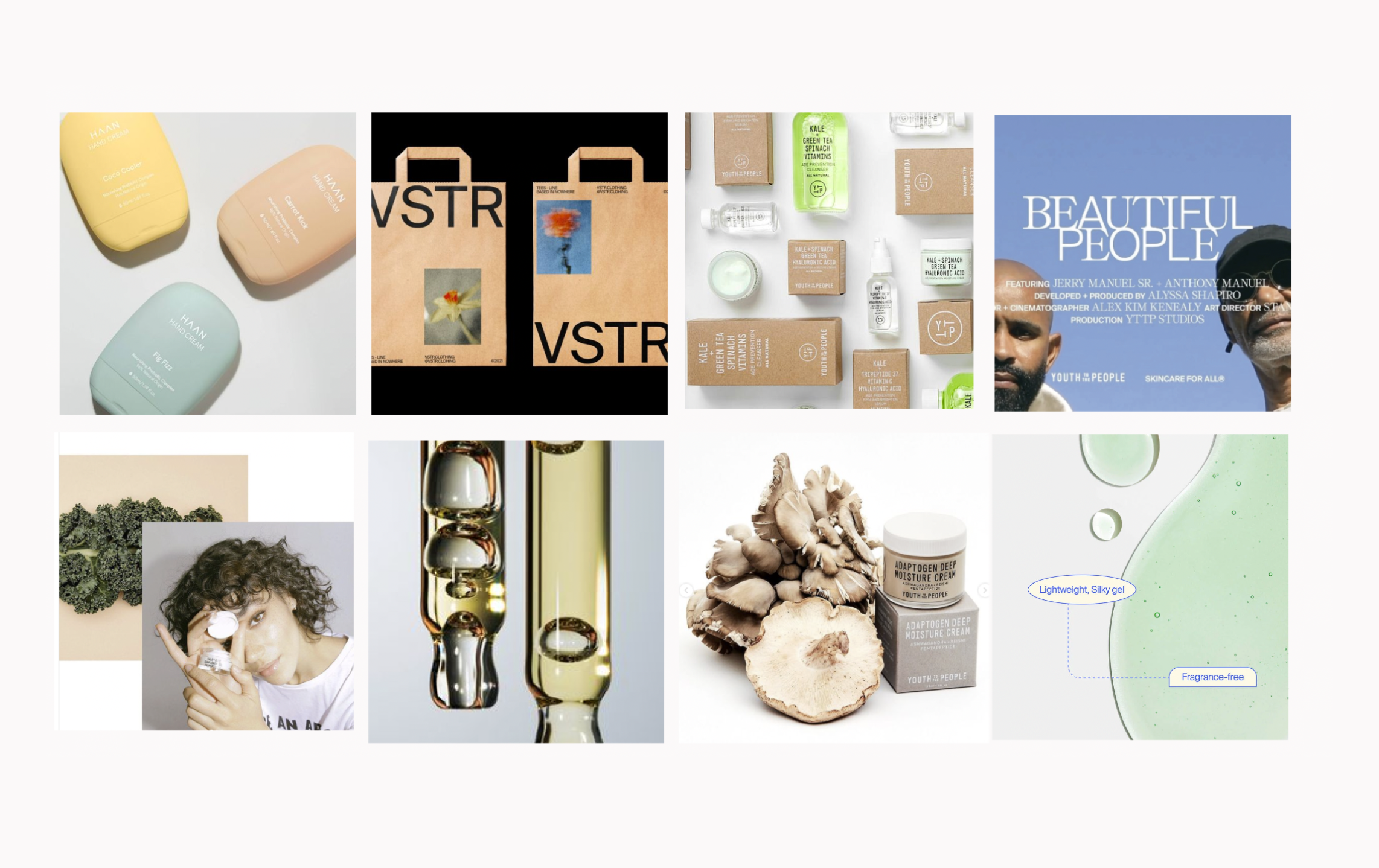
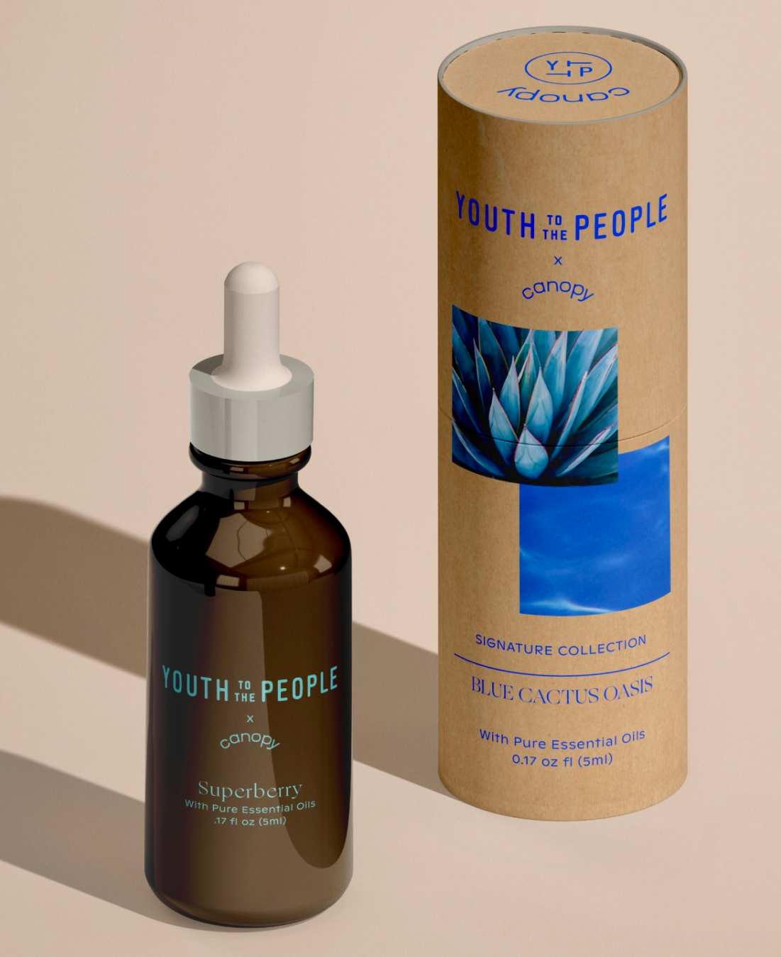
Drawing inspiration from Youth To The People’s range of nutrient-rich superfood plant extracts, this design strategy focuses on highlighting the superfood ingredients directly on the packaging, while contrasting it with the hydrating properties provided by the Canopy diffuser for the skin. By incorporating elements inspired by grounding surfaces, cropped product textures, neutral packaging, and dreamlike photography, this packaging aims to create an elevated experience for Canopy’s customers.


Strategy
Transparency about the ingredients is essential in providing an interactive experience and inspired this design direction. This is why have chosen to showcase them not only through words but also with captivating images which triggers a sensory experience
Typography
Typography used incorporates Canopy’s signature aroma font “Ogg” to call out the signature scent. By creating this hierarchy highlights the Superfood ingredients to be defined
Photography
Dream-like photography leverages both Canopy’s warmth and Youth to the People’s energy to create an enhanced experience for Canopy’s customers whether they are Skin Enthusiasts, New Parents, or Wellness. These photos appeal to everyone as it is a nod to the ingredients of the product from a macro pov
Color
The color used is inspired by the Superfood ingredients and their original product color. Taking vibrancy of the shades from Youth To the people’s branding color palette and applying it with the paper texture allows for the copy to pop and create emphasis
Textures
Cropped textures and grounding surfaces aim to highlights the contents of the product as well as its benefits by focusing on the ingredients shows the purity within the product


